


Ploito as a tool for employers
In Ploito, there are numerous metrics that allow evaluating the work and status of employees. All these metrics can be roughly divided into precise ones, based on the work schedule and behavior of employees, and evaluative ones, based on the emotional state. In this article, we will discuss each metric and the importance of analyzing it for a manager.
Telepresence statistic
The statistics consist of an hourly timeline with minute-by-minute detailing, visually representing the employee's activity. The following employee states are logged:
- In the stream (blue color)
- Online (green color)
- Walked away (red color)
- Offline (no color)
States where the employee was at the computer and stepped away within 5 minutes are displayed as a blend of corresponding colors with varying contrast.
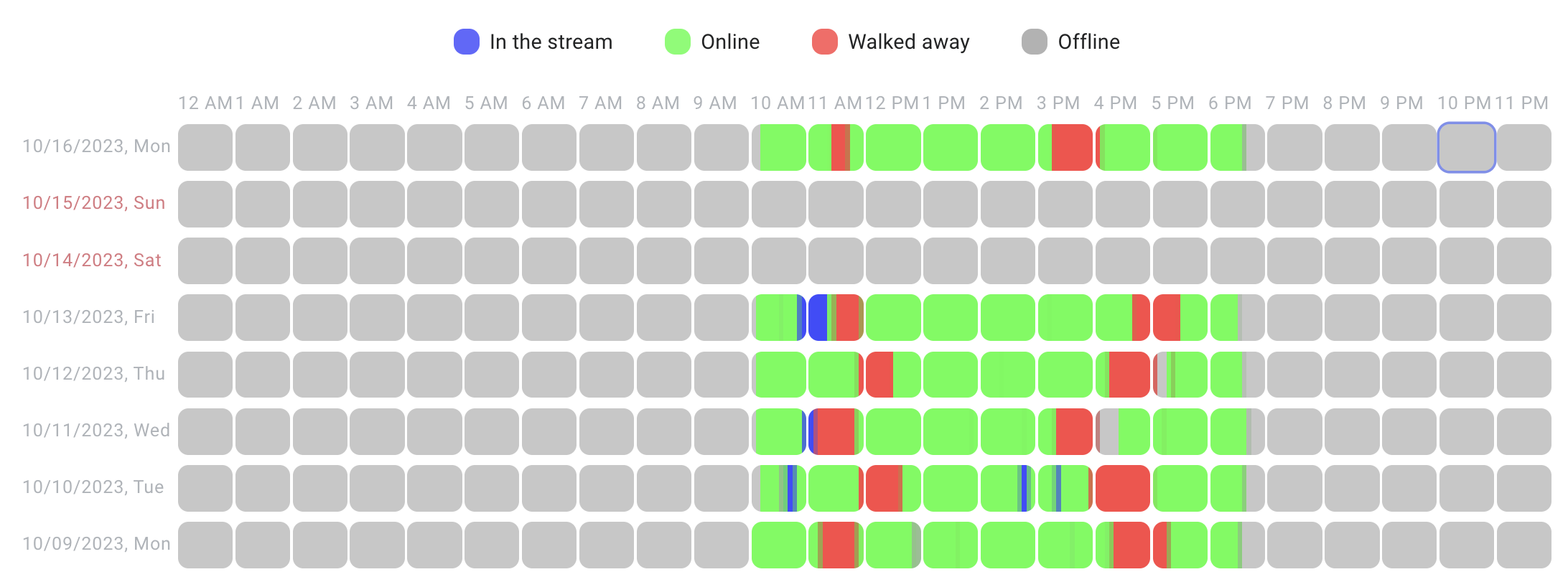
Most metrics in Ploito are indeed generated based on telepresence data.
Attendance
The metric shows if an employee is working more or less than their scheduled hours. If someone often stays late, their productivity can be over 100%. On the flip side, if they consistently finish tasks late, it could be under 100%.
In the screenshot, the employee is using all their work time, and small differences like 3% don't really matter.
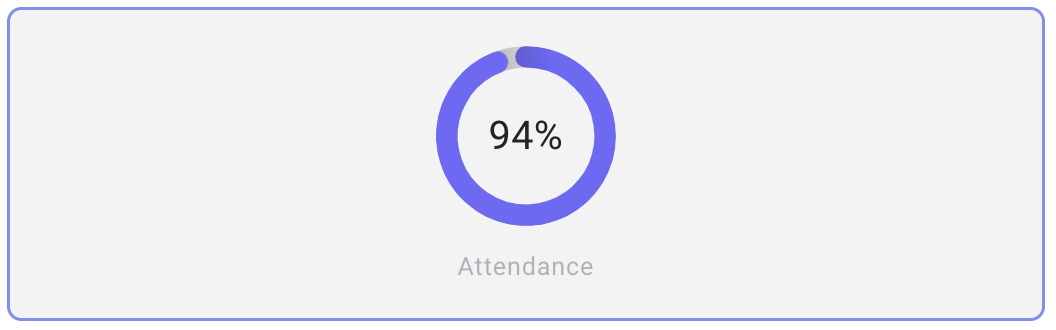
The attendance indicator, like any other metrics, can be assessed over the entire period of employment, the whole year, or the last 30 days.
Additionally, the attendance is presented in a user-friendly graph where each column represents the output per day or month.
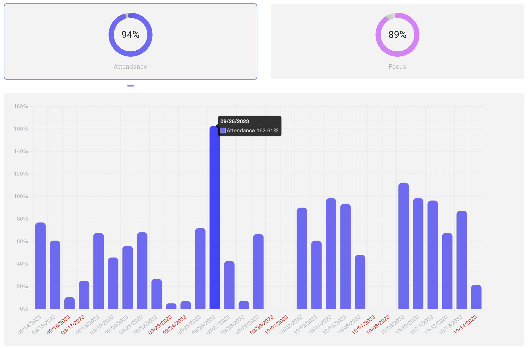
Weekend days are marked in red. Hovering over a column allows you to see the date and the precise productivity percentage.
Displaying the data by months is also valuable, as it helps identify the busiest months for an employee, signaling the need for a break. Conversely, observing the slowest months can prompt a conversation to understand the reasons.
In the context of remote work, analyzing productivity over time is especially relevant, because with time remote employees start working less.
Focus
An employee can complete 8 working hours, starting at 8 am and finishing at 5 pm. Alternatively, they might take extended breaks during the day, resulting in the workday extending, for example, until 8 pm. In both cases, the employee meets the hourly work requirement, but the boundaries of the workday differ.
In such situations, we are talking about how focused the employee is, specifically how quickly they complete their working hours within the actual work schedule for the day.
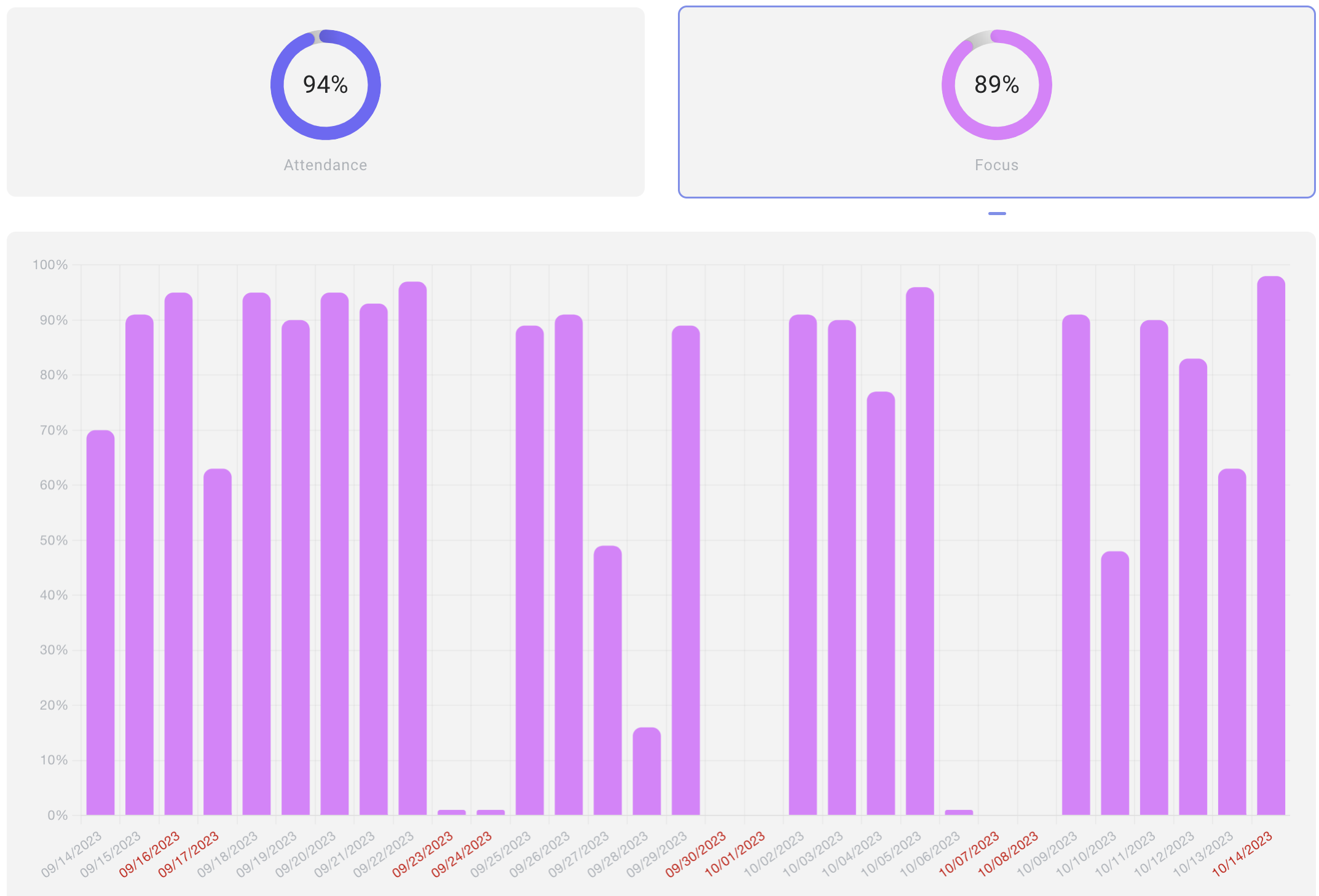
Focus is calculated using a special formula based on employee productivity and their work schedule, expressed as a percentage. The higher the percentage, the more focused the employee is.
The metric is also presented in the form of a bar graph with the option to group data by months or days.
Focus doesn't always need to be high; it's highly individual and depends on the nature of the employee's tasks. For creative tasks, like design or content creation, demanding immediate execution is impractical. This metric becomes crucial when the quality of work depends on how quickly the employee completes it. Otherwise, for tasks with flexible deadlines, managers may not be concerned whether the employee finishes by 5 pm or 10 pm.
Continuity, work schedule and timetable stability
These metrics are grouped together for a reason—they all, in one way or another, relate to adhering to the work schedule and showcase an employee's ability to work disciplined and without distractions. Let's break down each one.
Continuity Metric indicates how much an employee works without breaks or distractions. It's noteworthy that three or fewer distractions per hour are considered 100% continuity. Anything more reduces the score.
In the modern world, we often struggle with low attention spans, constantly seeking distractions. A low continuity score may suggest employee procrastination. In conjunction with other metrics, it could also point to improper time management and task distribution, making it challenging for the employee to stay focused and remain at the computer.
Work Schedule Metric doesn't show the schedule defined in the employment contract but rather the one that emerges based on the employee's actual work (for instance, if the employee's workday isn't precisely regulated). The importance of this metric lies in the ability of managers or colleagues to predict when to expect the employee online, avoiding unnecessary disturbances.
Consistency of Work Schedule Metric indicates how stable an employee is in starting and finishing their workday.
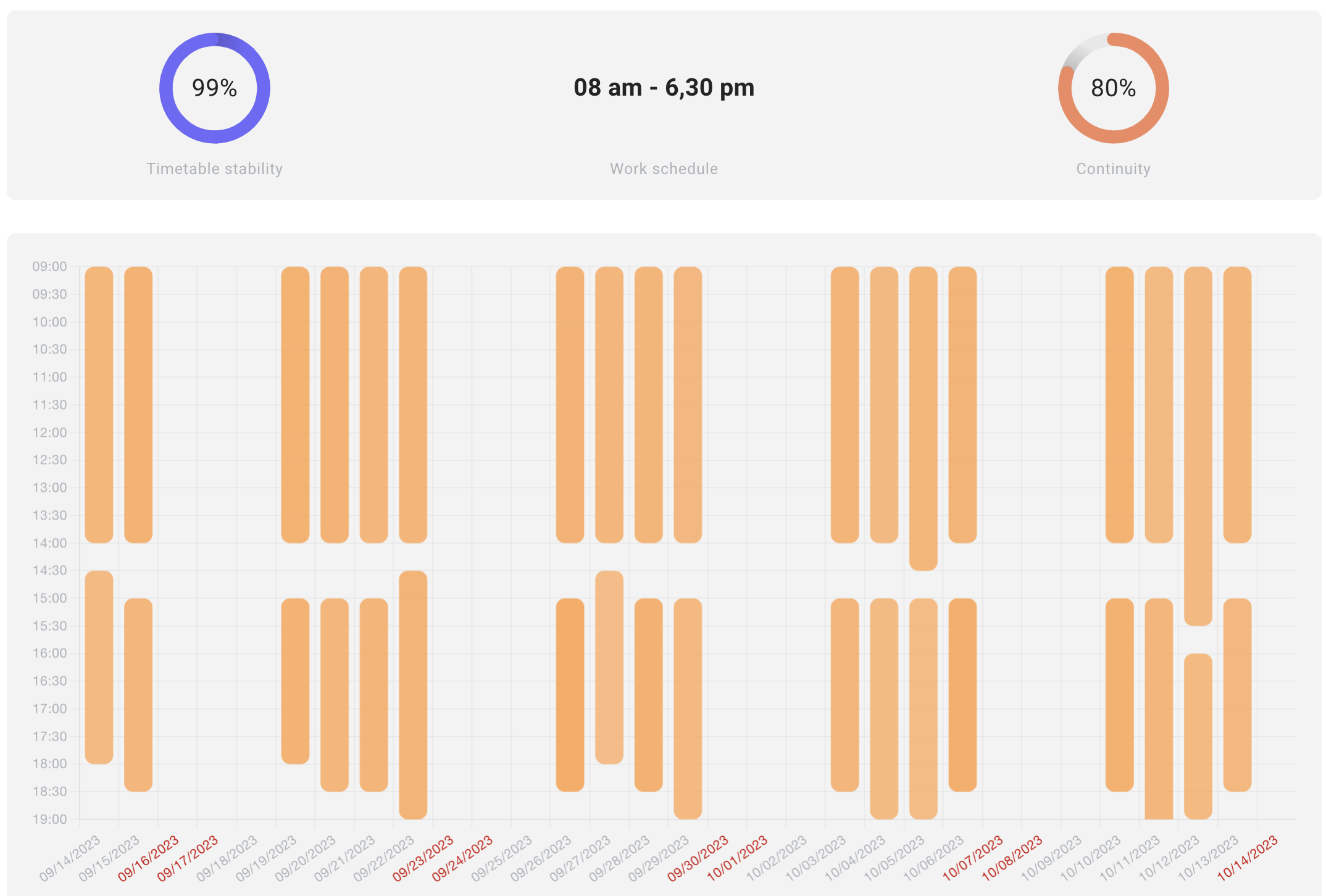
You can't judge if someone is doing well or not just by looking at these numbers. Everyone works differently, especially for creative tasks. Keeping a constant workflow or sticking to a set schedule can be tough. But, when it comes to dealing with HR matters, these numbers can be pretty useful.
Satisfaction, fatigue, and burnout
Unlike the metrics described above, which are automatically calculated based on an employee's working hours, fatigue and satisfaction metrics are self-assessed by the employee. At the end of the workday, they can rate how tired they feel and how satisfied they are. Based on these ratings, Ploito calculates the level of burnout, for example:
- If an employee feels more tired than satisfied, it indicates that the day contributes to burnout.
- If an employee feels both maximally tired and maximally satisfied, it also has a slight impact on burnout.
- If an employee feels more satisfied than tired, then the day does not contribute to burnout significantly.
The metrics are visualized on a graph with a breakdown by days or months, allowing managers or HR to monitor employee burnout before it reaches a critical level.
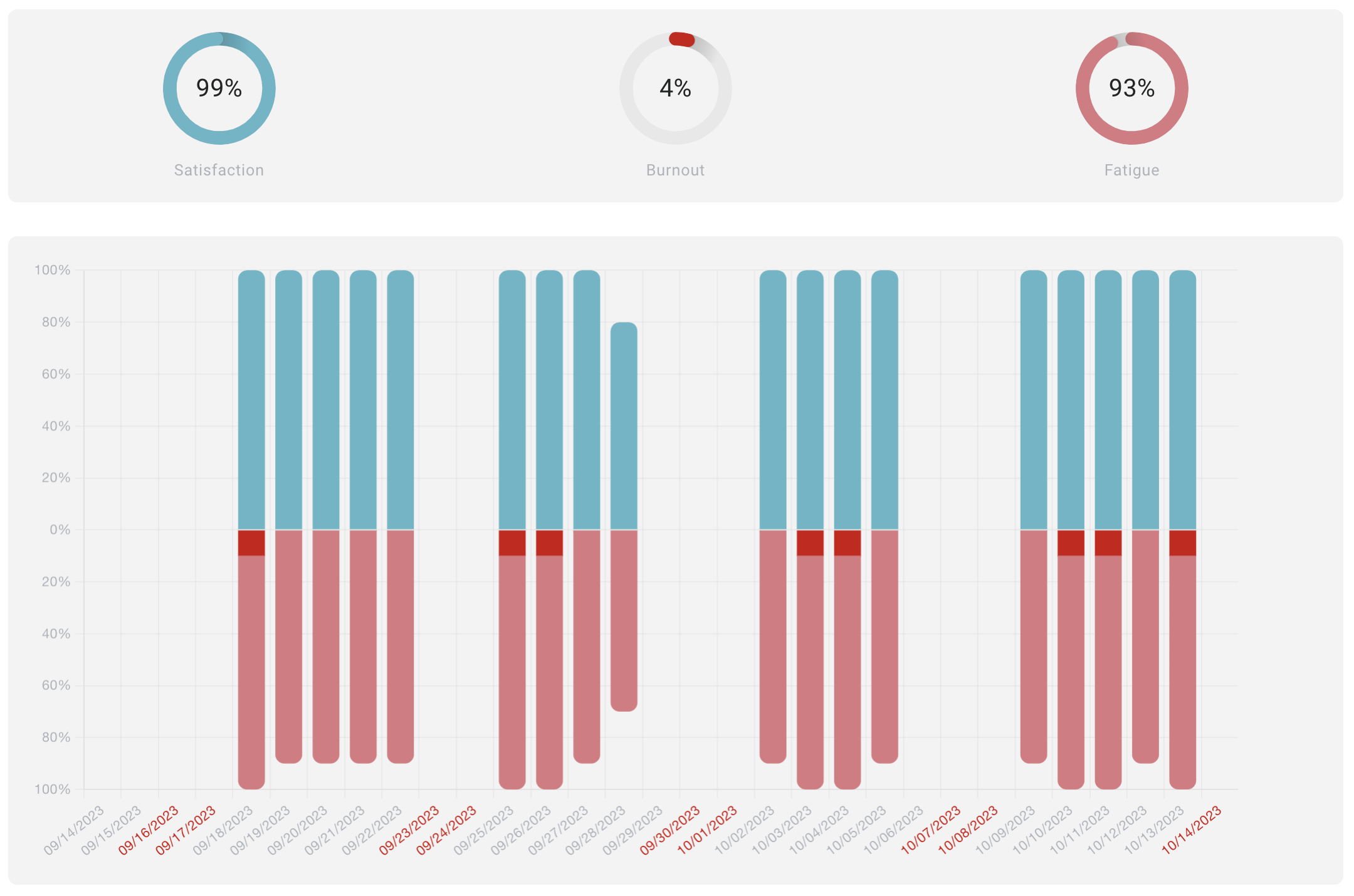
The burnout level is represented in red on the graph. Alongside the daily rating, the manager can also view daily task lists of employees with comments, serving as an excellent tool for addressing burnout.
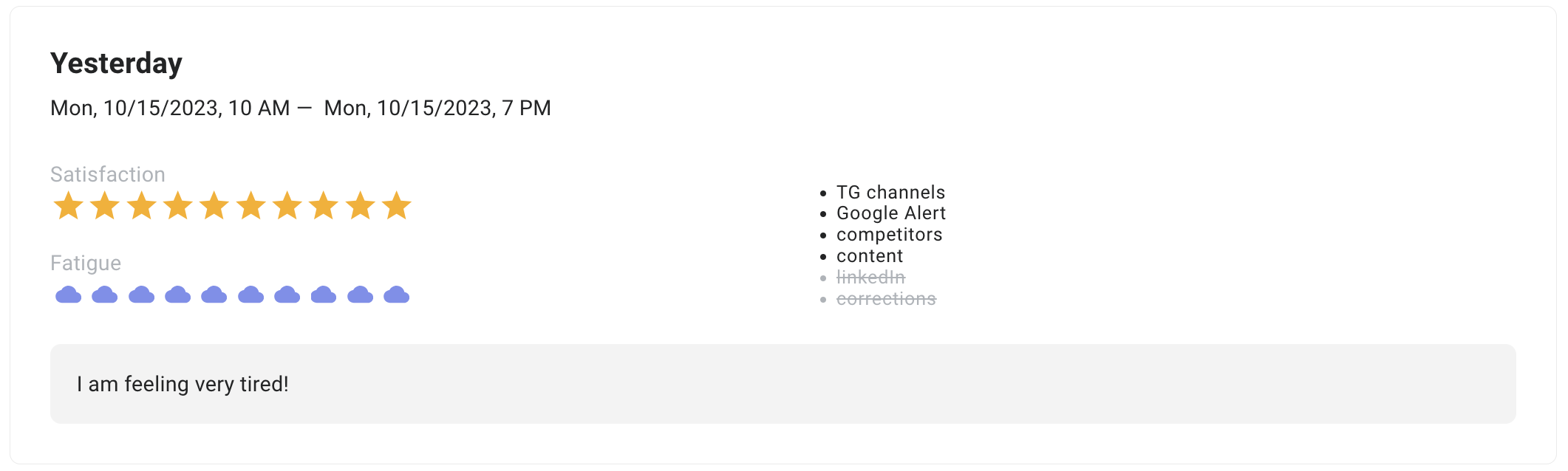
The screenshot shows the tasks that the employee couldn't complete, their self-assessment for the day, and the comments they left.
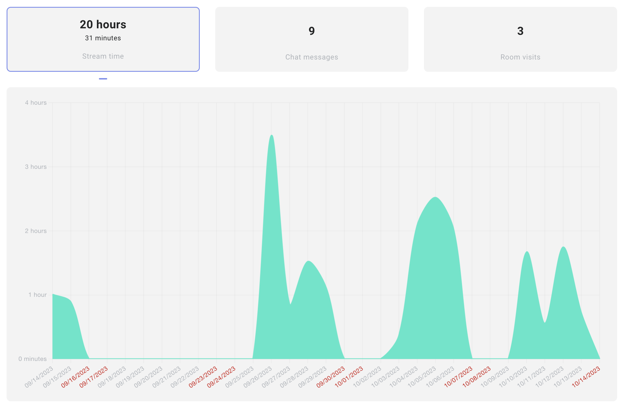
Stream time, chatting, and visiting other rooms
These metrics reflect the employee's communicativeness and are generally designed more for interest than practical purposes. However, when combined with other indicators, they can serve as valuable supplementary information.
Rating and leaderboard
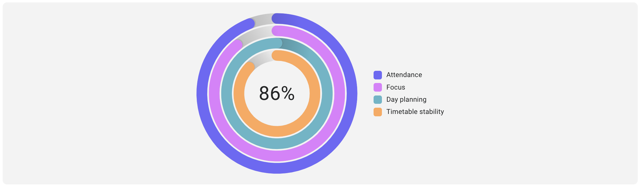
Some of the metrics, namely attendance, focus, daily planning, and schedule stability, contribute to the formation of the final rating. The rating is presented in a circular format, where each segment represents an individual metric, and the cumulative percentage rating is displayed at the center.
Based on this rating, all employees secure their positions in the table, showcasing all the metrics included in the rating.
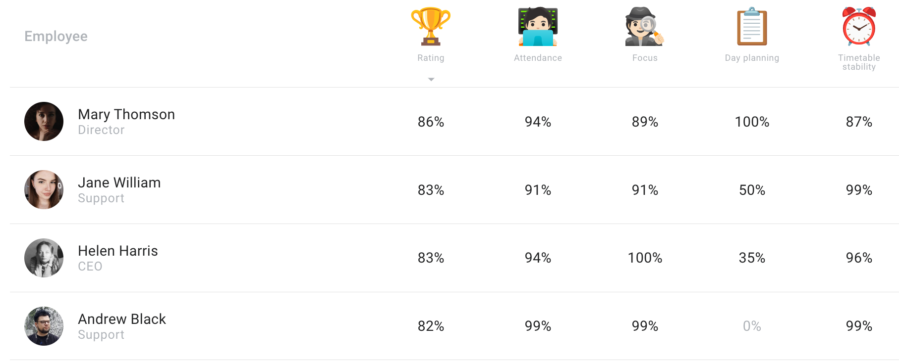
Having a rating and tournament table can be an excellent motivator, but it's important not to rely solely on them for evaluating employees. Due to the diverse nature of each employee's work, blindly adhering to rating metrics can be misleading. Therefore, a thorough analysis of all metrics and effective personnel management is crucial. --- Ploito is an excellent assistant for employers or HR managers who want to identify employee burnout before they submit a resignation. Ploito is a tool that goes beyond mere monitoring; it's about taking care of employees.
We hope our experience proves valuable and helpful for you. Also, we have a short video clip where, in 2 minutes, you'll learn the most important things about Ploito!


